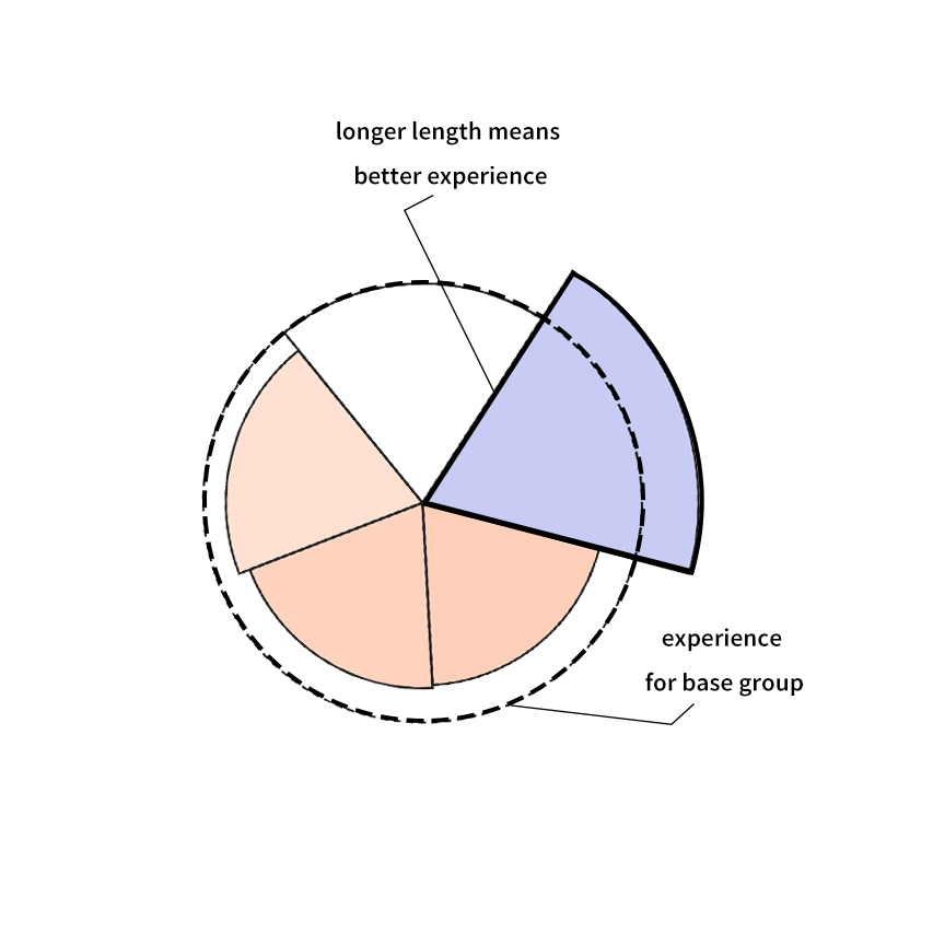
This interactive visualisation lets you explore the differences in patient experiences across Scotland. The data shown are odds ratios (which describe differences between different groups) calculated from the 2011 Scottish Health and Care Experience Survey. The analysis examines the relationship between self-reported experiences of patients and a range of patient, GP practice and regional level characteristics. The glyphs below symbolise inequality: The less round, the more difference in the reported experiences of patients.